|
Winsham Web Museum - a new approach to recording village history ( 2002) Technical Overview
The following notes are intended for those who are thinking of creating their own Web Museum but don't yet have the design skills or website building experience. Building a website is not difficult. Building a website that doesn't look as though it were made by a disinterested three year old is only a little more difficult - all it really takes is attention to detail and remembering one or two basic design tips. Making a website that is fast and efficient is, again, only a matter of applying basic technique. You may be able to pick up the basics of website design from a book or by dabbling with a software package such as Microsoft's FrontPage, but a brief course would be much better. Once you have the basics of website construction the following notes will hopefully be of some help.
The advantages of a virtual museum are many but, briefly, they offer the following main advantages over a traditional "bricks and mortar" museum :-
It is possible to build and host a website at no cost at all but there are drawbacks to using 'free' internet service providers, not least the restrictive amount of webspace (usually around 15Mb) you are given. To get around this, simply create more than one free account and hyperlink them together. The Winsham Web Museum hosting with unlimited webspace, and including the domain name, is currently less than Ł30 a year. Design
costs can be free if you have the expertise to do it yourself.
Alternatively it may be worthwhile to consider a professional design and
setup package with hosting and domain name included. This will cost in
the region of Ł200 to Ł300. Ongoing maintenance, adding and updating pages, etc. will only cost your time but, be assured, there will be lots of it required.
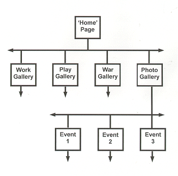
The layout of the Winsham Web Museum was visualised at concept in a galleries - rooms - cabinets fashion that readily equates with a computer's folders - sub-folders - files hierarchy. However the cross-linking flexibility that a website offers is invariably overlooked or underestimated and there is a huge tendency for the beginner to think of a website only as a rigid structure, thereby greatly limiting its potential. Having made the point about the website's potential flexibility however, from the web designer's point of view, the underlying structure of any website that is eventually to be maintained by non-professionals must be fairly rigid, simple yet comprehensive, while maintaining the potential for infinite development - which is a lot easier than it sounds. It is far better to start with a good, hierarchical directory structure. The diagram below shows a simple website structure with four 'galleries'. Each is a directory or folder within the website and as many directories as necessary may be created. Each directory may then be divided into subdirectories, and so on. In this way all the files, pages, etc. relating to a particular topic are easily found. Later on, as the website grows and grows, the benefit of splitting the content at this early stage will be appreciated.
The 'Home' page contains the navigation to the main sections of the website. Each main directory, or gallery, may have its own navigation page.
It may be thought by some that the appearance of the website doesn't matter. If you are happy with second rate that's fine - but it is not difficult to achieve a website that is at least one step above amateurish. All it takes is a little thought and care. Use the following as a checklist;
There are two ways to achieve consistency. The first is to use Cascading Style Sheets which predetermines page elements such as font style and colour. The second is to only have one person constructing webpages ( as does the Winsham Web Museum) - not ideal as it places the greatest amount of work on the shoulders of one person. Having said that, it is important that only one, definitive version of a website exists locally or problems very quickly occur as to the 'latest' version of any page. Ideally, perhaps, one person should be in overall control of the website and its appearance with others having delegated responsibility for creating and maintaining individual 'galleries' within the overall 'house' style. These gallery owners would then forward their work to the website manager for him to include in the online website.
Nothing 'kills' a website more effectively than the poor use of graphics. Large graphics make a website slow (often fatally slow) to download. A few graphics pointers;
The Winsham Web Museum, as you see it after 18 months, has taken over 300 hours of my "spare" time - and, as a professional web designer, I'm very fast at optimising graphics, creating pages, etc. So, be warned, a lot of time is required - something most people will greatly under-estimate.
The Winsham Web Museum uses a frames construction to ensure the navigation to main sections is always visible on screen and framesets within framesets for areas such as photo galleries - if you don't know what I'm talking about, I'm afraid you'll need to read a book or go on a course. The swishy, yet versatile, drop-down menu is a Java 'applet' that costs about Ł20. The structure of the website is as simple as possible to allow future maintenance and expansion by anyone with a minimum of training. Essentially each 'gallery' has its own directory. Each event within the photograph 'gallery' has its own subdirectory within the photo directory. The website is designed to be viewed at 800 x 600 pixels (51% of users have this screen resolution) but it may also be seen at higher resolutions with little ill effect other than text not aligning fully with images. (Only 35% of users have a screen resolution setting of 1024 x 768). For purposes of maintaining fast download times all images on the website, except group photographs, are restricted to 350 pixels on their longest side. Thumbnail images are restricted to 80 pixels on their longest side. Some higher resolution images of, say, rare old photographs are archived but not displayed as part of the website due to their very large file sizes. The typeface used is 10pt Arial, navy on a white background. This is a clear, modern font that is easy to read on a computer screen. Navy on white gives better legibility contrast (and is therefore less tiring to read) than black on white for large tracts of text. Now that browsers are catching up technically, Cascading Style Sheets are used to give a consistent look and feel to webpages and to enable anyone to maintain the website with a minimum of training. Javascript is used on most pages, for example to prevent right-clicking and copying of images. Javascript and DHTML, where possible, take account of all browsers but Internet Explorer v5+ (with a market share in excess of 87%) is given priority. All versions of Netscape (which is far less tolerant of Javascript and DHTML) have a combined market share of less than 6%.
Click HERE to return to Browse Index Click HERE to return to Site Map
|